Redesigning the Fiserv Merchant and Developer Portal with payment terminals app
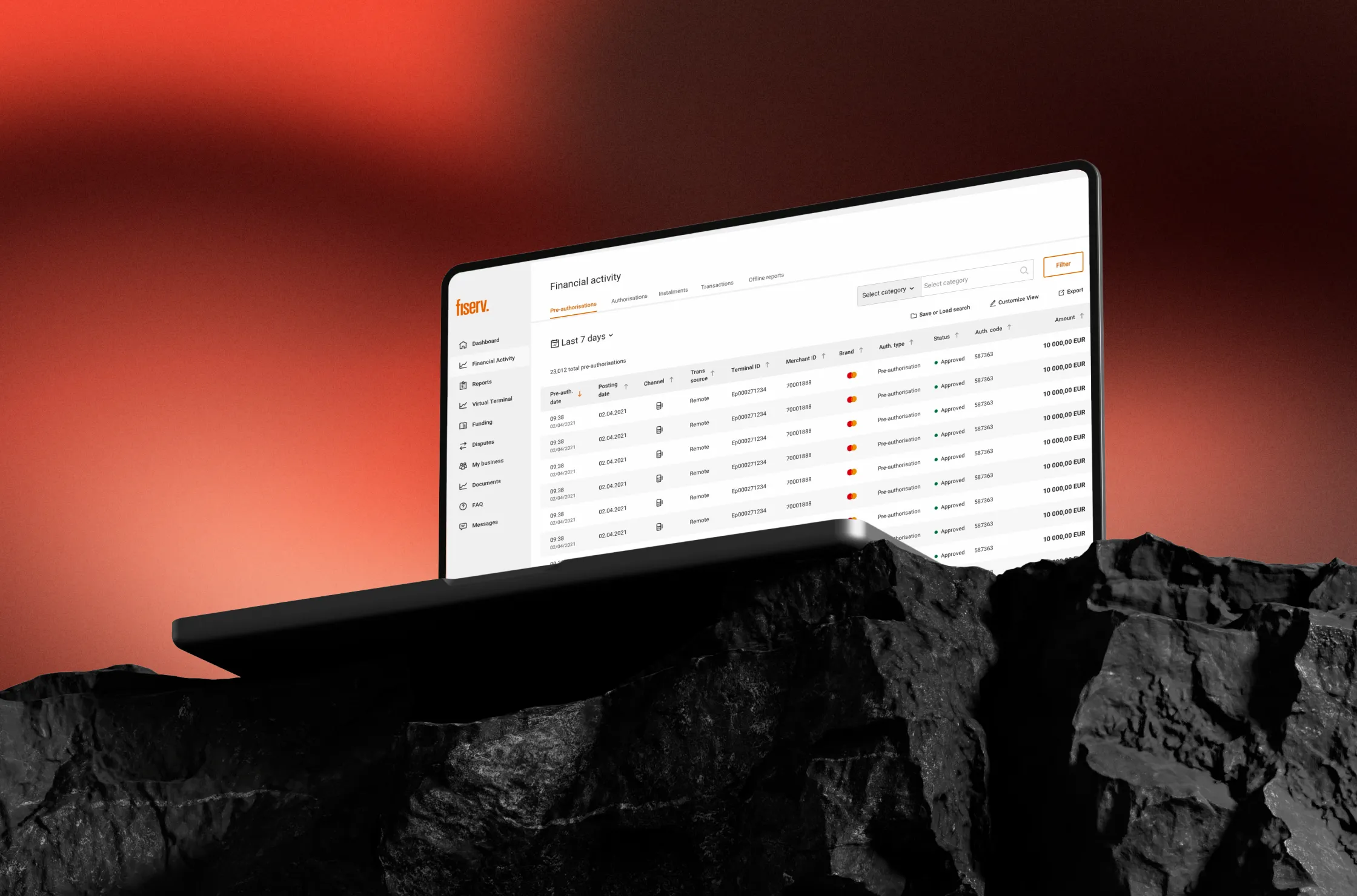
This portal is where small business owners across more than 100 countries process payments, manage chargebacks, and run their day-to-day operations, all under a hundred different regional brands built on one shared Fiserv foundation underneath.
The legacy portal had both a consistency problem and a scaling problem. For close to a decade, the portal grew one alliance, one deadline at a time. Each partner ran its own re-skinned version with no shared source of truth: three versions of a data table, competing button systems, icons in five different styles depending on who was free that sprint. Launching a new alliance meant rebuilding large parts of it from scratch. When Fiserv rolled out a new corporate identity, the inconsistency became impossible to ignore.
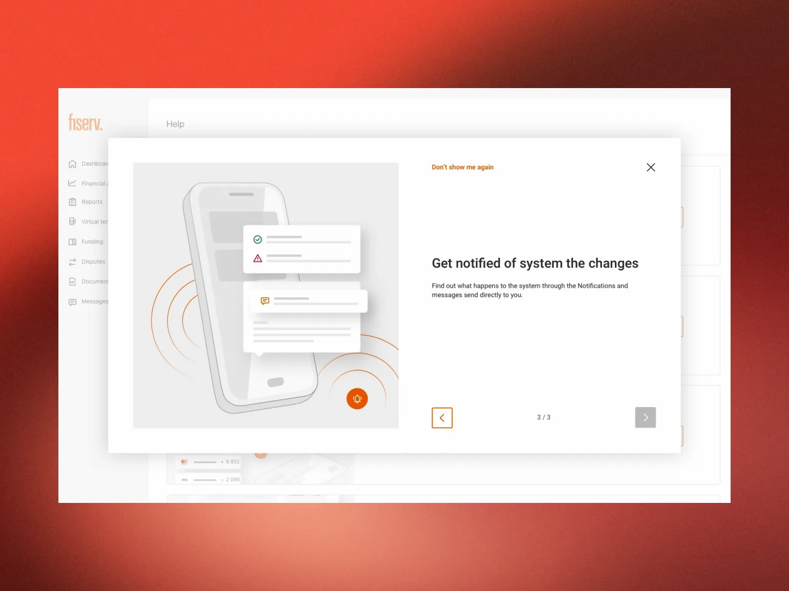
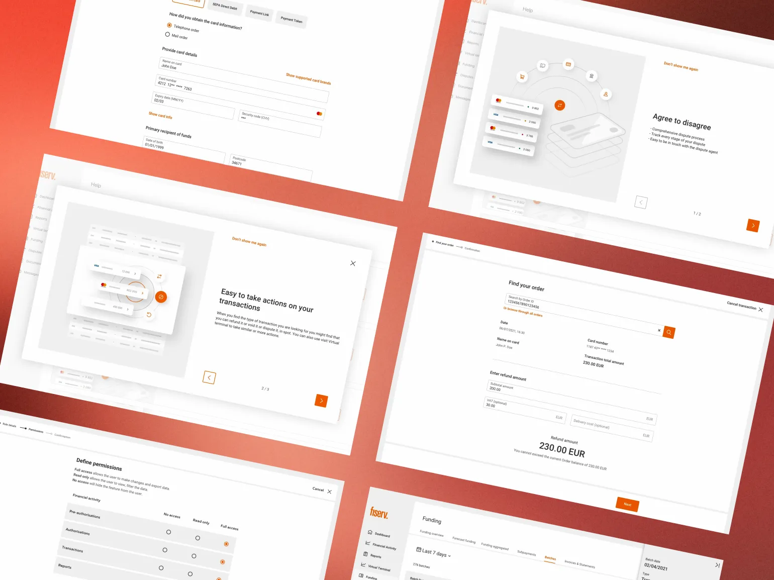
I owned the two things every alliance would end up sharing: the components and the visual language on top of them. I personally designed a large share of the portal's page templates: dashboards, transaction tables, settlement reports, and dispute-management flows. And I built the entire icon set and every Fiserv-branded illustration used across the platform. Everything else was built on top of that foundation.
Leading 10+ designers across five countries meant protecting consistency in real time. I ran daily calls with the full distributed team, reviewing work in progress, giving direct feedback, and making the final call on what shipped into the shared library. With that many people building in parallel, a style guide alone wasn't enough, consistency had to be actively defended, decision by decision.
The Developer Portal: the same system, led by a team of two. Where the Merchant Portal was a team effort with 10+ designers, the Developer Portal was a much smaller one. I led the redesign with one other designer, covering the landing page, API documentation views, and application management console, to make Fiserv's APIs feel approachable enough that more developers would build on them. I created a new icon and illustration set and established a new visual language for Fiserv's landing pages more broadly. It proved the system worked at a very different scale: the same logic that took 10 people on the Merchant Portal, we delivered with a team of two here.
POS terminals: the design system I built for a browser ended up on physical checkout counters. I designed all the page templates and a library of 50+ animated illustrations for Fiserv's POS applications, then directed a team of external designers producing the full set of screen variants across Fiserv's terminal hardware line. If you've paid at a Żabka store or a restaurant counter in Poland, there's a good chance you've tapped through a screen built from templates and illustrations I designed myself.
Token-based theming
All 80+ components pull brand color, logo, and type from a per-alliance token set, so a new alliance can launch without a single custom screen.
A shared icon and illustration language, built by hand
I designed both from the ground up, which is why they held together as one identity across a hundred color schemes.
Components documented to the state level
Every component and template shipped with usage rules and states, so designers and developers I'd never meet could build with it correctly the first time.
Daily design governance
Ten designers, one person accountable for what shipped, that was me.
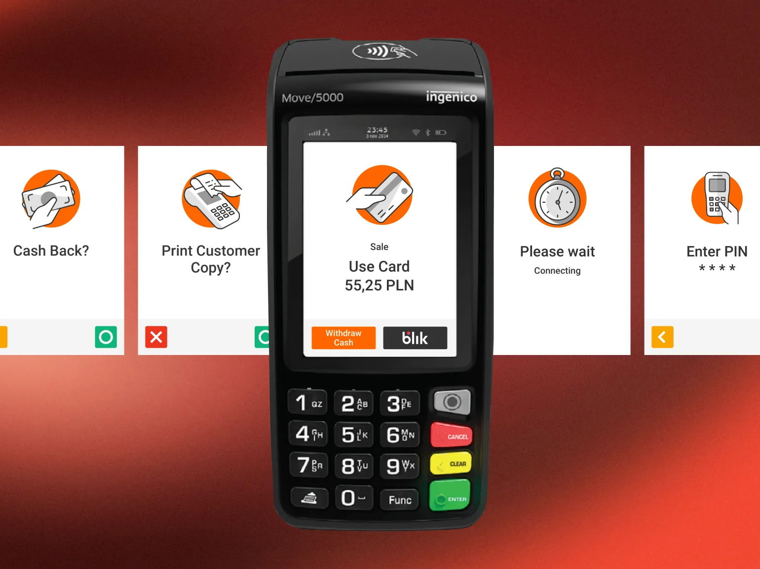
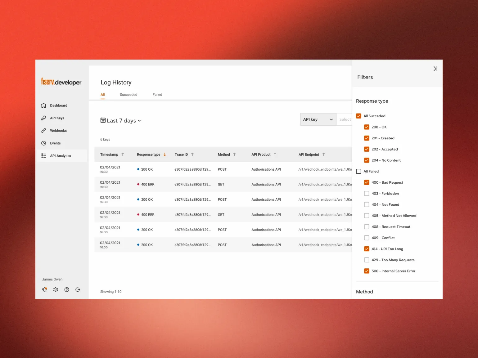
The result: one design language, three products, three different team structures. By the end of 2022, the same components, icon set, and illustration style ran across three products: a web platform serving 900,000+ merchants in 100+ countries, a developer portal, and a POS terminal line reaching physical checkout counters nationwide. New alliances onboarded faster, designers shipped consistent UI from day one, and the visual identity held up whether it was extended by 10 designers, by no one but me, or by an external team I'd never worked with.
The lesson: a design system only proves itself when it survives without you in the room. On the Merchant Portal, I was one of ten designers, keeping everyone aligned. On the Developer Portal, I led with one other designer. On the POS terminals, I designed the originals and directed external designers who'd never worked with me. Three completely different team structures, same design language holding up in all three. That's the real test of a system: not whether it looks good in the file where you built it, but whether it still looks like your work after passing through hands you don't control.
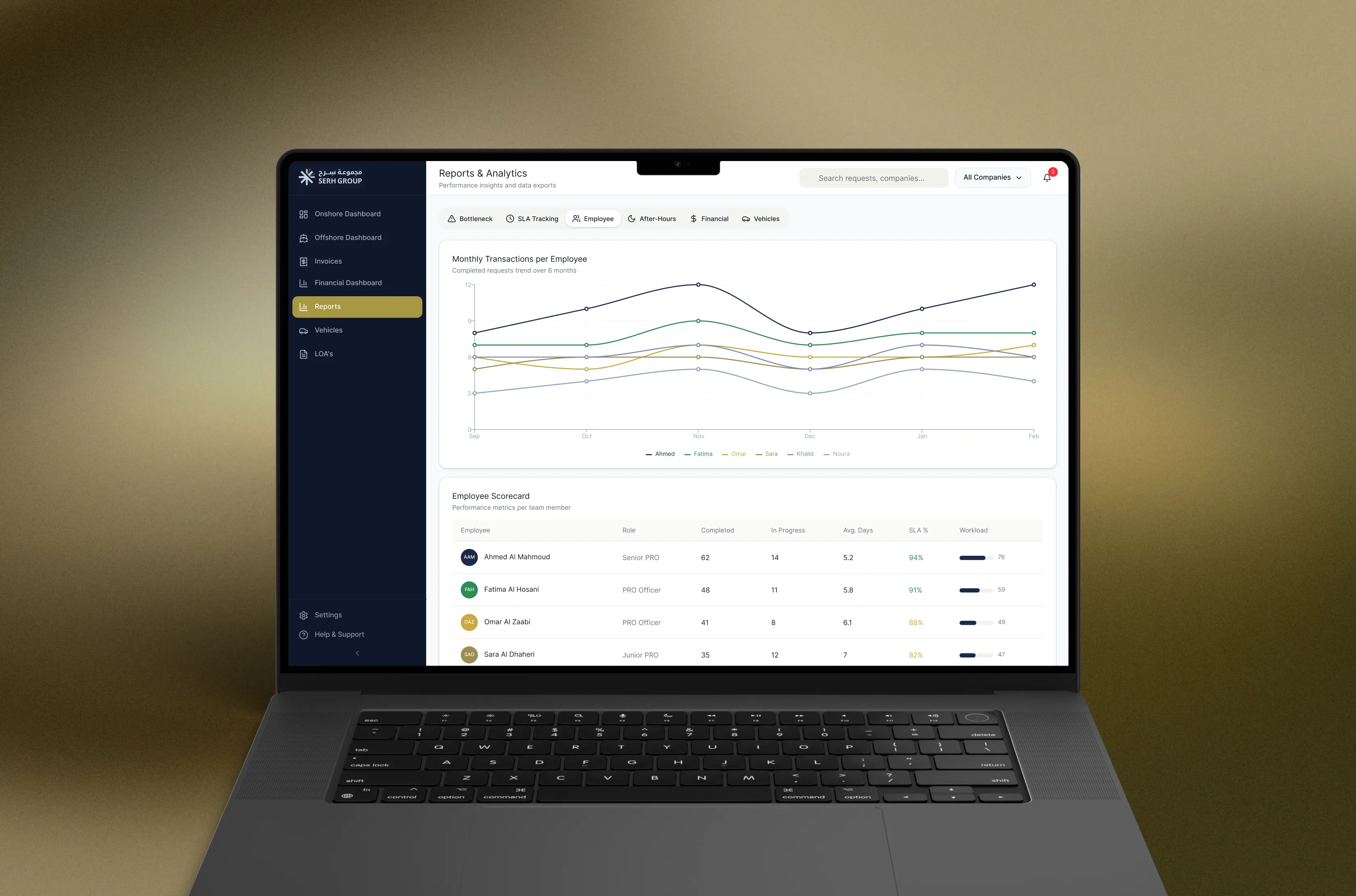
Build in code a high-security vehicle clearance system across Abu Dhabi's oil and gas sites
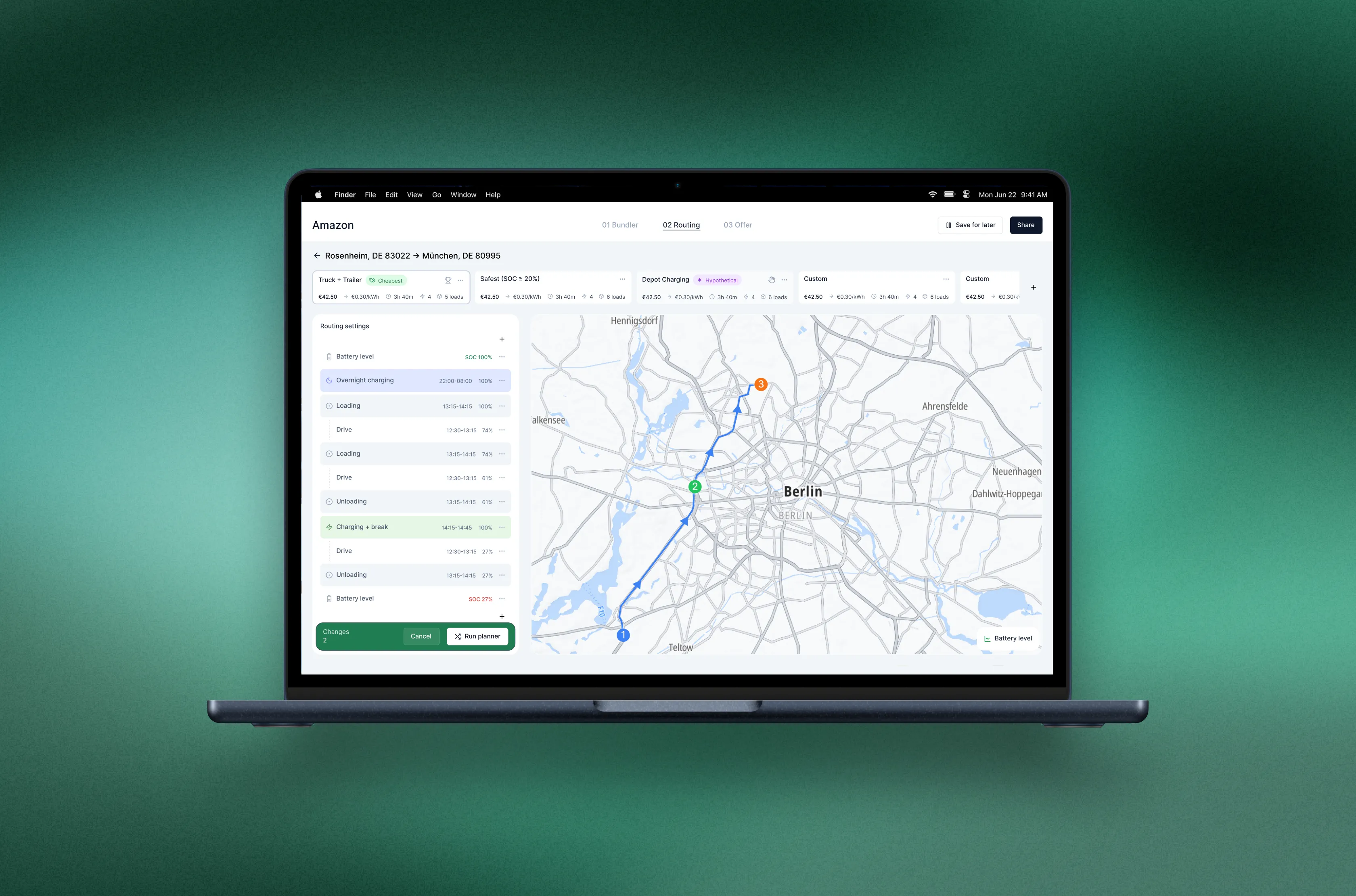
Designing the Load Bundler, the first real tool for planning electric truck fleets