Redesigning the app, hotel frontline staff use every shift, across 2,600+ properties
This app is the operational backbone used daily by engineers, housekeepers, inspectors, runners and guest-relations managers across more than 2,600 hotel properties worldwide. For the large majority of daily users it's the primary tool of the shift, not a secondary or occasional one.
The legacy app had both a usability problem and a trust problem. Different roles shared the same interface despite completely different goals and workflows, which cluttered navigation and buried the actions people actually needed. Common tasks took too many steps, and the experience became unreliable the moment connectivity dropped. It was a real problem for a workforce on older devices, moving fast, often in low-signal parts of a building.
Staff had started working around the app instead of through it.
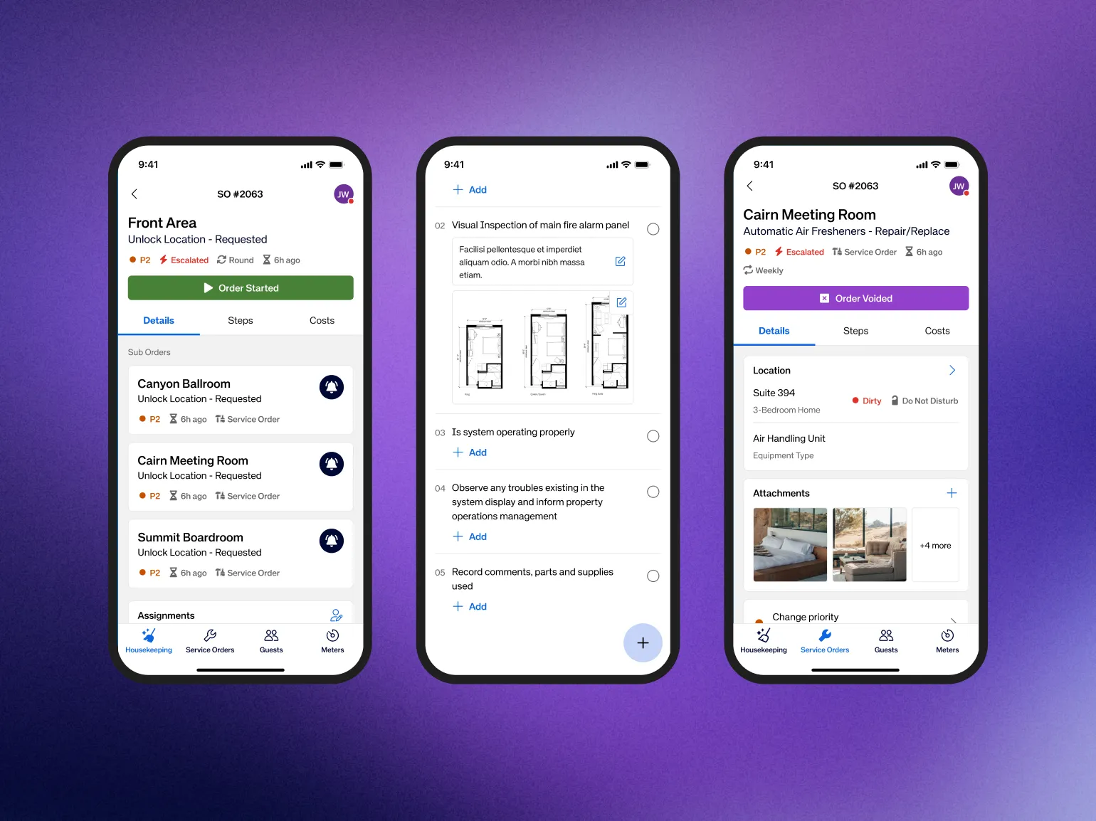
Two weeks of discovery with client stakeholders reframed the brief before any screen was designed. We mapped how each role actually completed tasks across a shift. The insight that mattered most: staff were moving and multitasking, often in poor connectivity, and needed to understand status at a glance rather than read anything carefully. One goal was explicit from day one, and I fully agreed with it to solve complexity by removing steps, not by adding screens.
The client needed faster operations, shorter onboarding for a high-turnover workforce, and reliable offline performance across a distributed network. Frontline staff needed something simpler: an app usable one-handed, understandable at a glance, that they didn't have to double-check. My role was to bridge those two needs through the product design itself.
Rather than building a distinct experience per role, I helped design a shared component architecture that adapts based on who's signed in. The underlying structure stays the same while task priorities, content and actions change by role, cutting cognitive load for users while giving the business one scalable system to maintain instead of five fragmented ones.
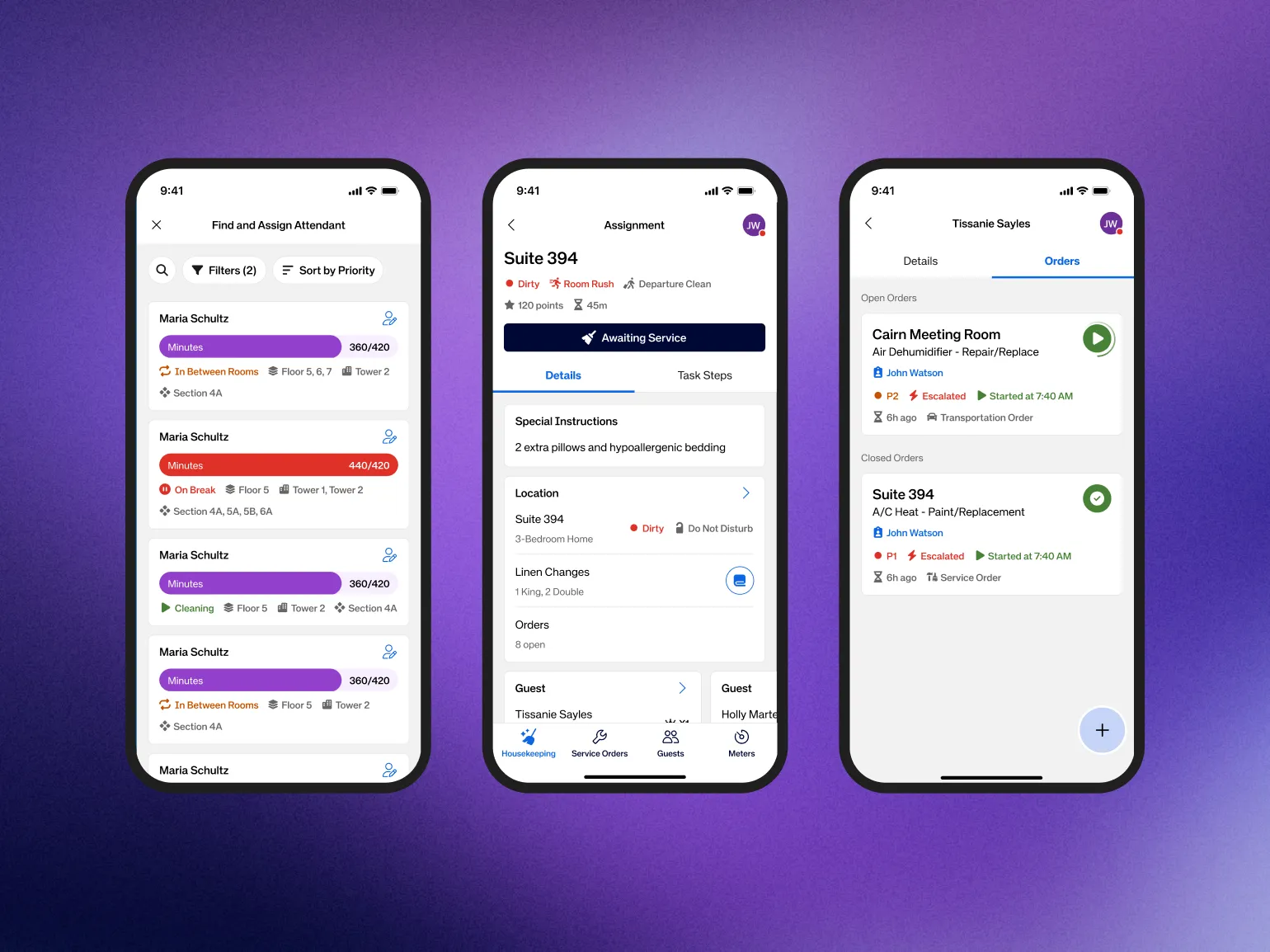
Role-based task views
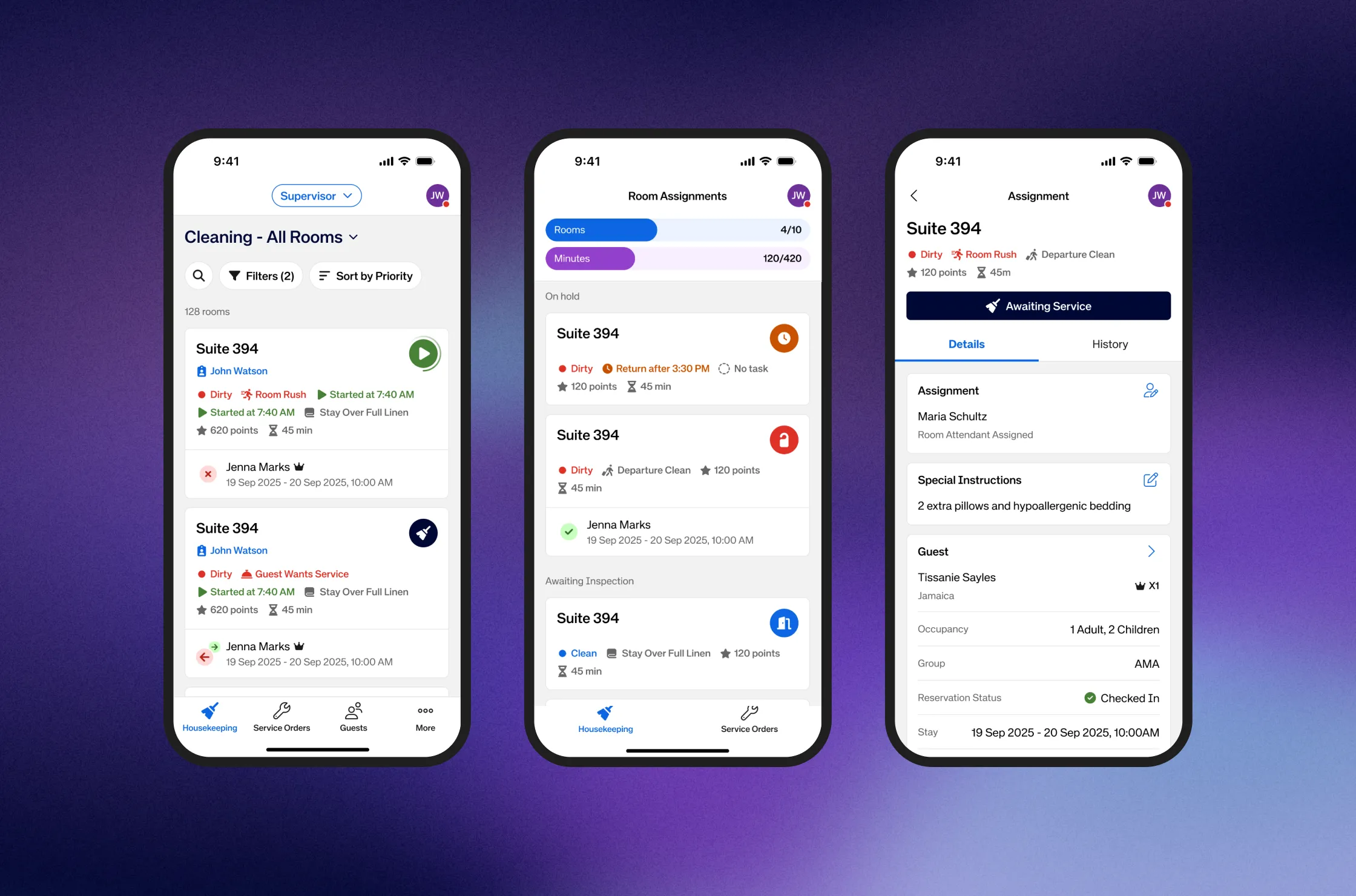
The home screen a housekeeper sees and the one an engineer sees share structure but not content, each optimised for that person's actual task list, priority logic and most common actions.
Status-first design
Every card and list item communicates status through colour, icon and label together. A room is clean, in progress or needs inspection; an order is open, assigned or escalated. Status is never something you have to navigate to find.
Offline mode with visible feedback
When connectivity drops the app keeps working and shows a clear, calm indicator instead of failing silently. When sync happens it stays quiet, unless something needs the user's attention.
Large touch targets
A minimum 44pt interactive area, with the most frequent actions given even more room. It's a constraint discovery made non-negotiable.
Minimal onboarding friction
New staff in hotels can mean new staff every week. It needed to become productive within a single shift. Icon-driven conventions with persistent labels, consistent patterns and contextual guidance replaced formal tutorials.
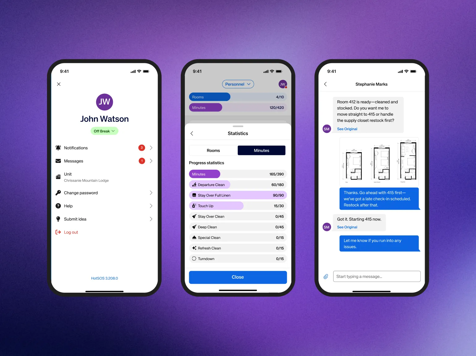
The redesign delivered one unified mobile experience covering five personas and 110+ user stories, built to meet WCAG accessibility as a baseline and to hold up across a multilingual, multi-property deployment.
The most common tasks for each role now live one or two taps from the home screen, replacing flows that previously required navigating several unrelated screens. Connectivity drops no longer stop work, staff keep completing tasks offline with clear visual confirmation. And the shared architecture means one team can maintain and extend the product for five roles instead of managing five separate, drifting experiences.
This wasn't a consumer app where a bad experience means people leave. Hotel staff couldn't opt out, so frustration didn't show up as churn, it showed up as silent workarounds like paper notes and verbal handovers that quietly eroded the operational data the whole system depended on. That's a distinct lesson from consumer UX: in captive-user enterprise tools you have to actively look for behavioural signals of distrust, because still using it doesn't mean still trusting it.